
Graph View
PacketSafari graph view is the time-series surface for packet activity, throughput, retransmissions, and other derived metrics.
Key benefits:
- Choose human-readable units for faster interpretation.
- Spot bursts, gaps, and suspicious timing changes quickly.
- Plot throughput, packets-per-second, or filter-specific series on the same timeline.
- Surface anomalies such as retransmissions or sudden traffic spikes.
The default graph view shows packets over time. Any packet list filter is applied to the graph automatically.
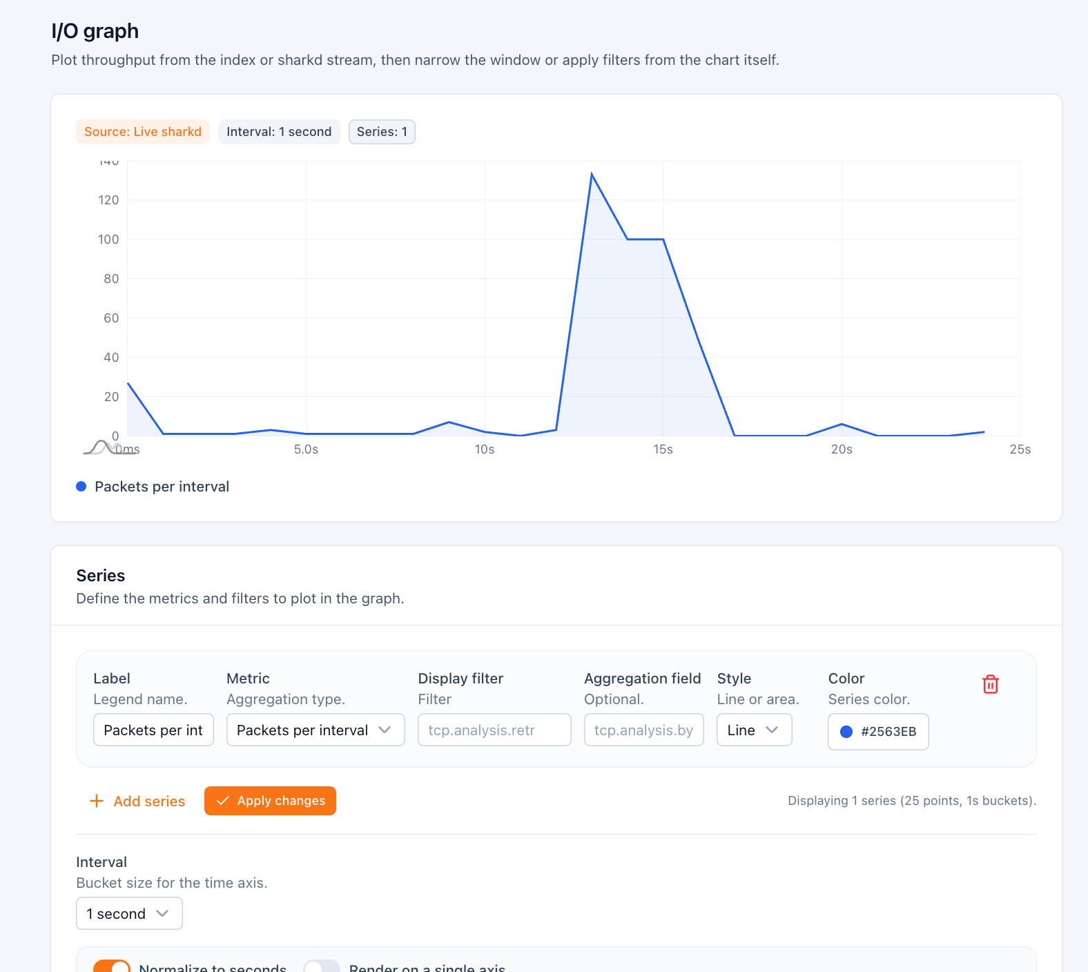
You can adapt the graph further, filter it, and aggregate values. The following graph shows:
- the throughput of all packets (black)
- the throughput of ICMP packets (yellow,
ip.proto == 1) - the number of retransmissions (
tcp.analysis.retransmissionaggregated with sum)
The units on the Y axis may also be different.
You can further zoom into the graph using the mouse or by changing the base time unit. In this example we see packets on the millisecond scale.
⚠️ Note that sometimes the selected scale might result in too many data points being displayed. In this case we automatically adapt the time scale to a sane value.
Predefined graphs
There are a few context-sensitive predefined graphs. They adapt to the currently selected packet in the packet list.
These are useful for common analysis scenarios.
Graph Presets
Similar to the predefined graphs, presets allow you to load configurations for common analysis scenarios. These are not context sensitive (they do not take the connection information of the currently selected packet into account).
One axis vs multiple axis
Depending on the data units plotted it might be more apt to plot just a single axis or multiple axes.